Struggling with measuring your PR campaigns? You’re not alone. According to Buffer, 82% of PR practitioners don’t know how to evaluate the ROI of their PR campaigns. With the right PR tools, however, you can tap into relevant data and analyze the results of your PR efforts.
Prowly Analytics
To start analyzing your PR performance, simply navigate to Analytics on the dashboard of your account:
Start with selecting the newsroom you want to analyse from the list available after you click on the "Account" button: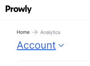
Before we go through each of them, keep in mind that all the data will refer to a chosen scope and specific time frame. You can determine the scope and time frame by choosing options from the drop-down menu in the right-upper corner:

Traffic to your newsroom
This chart shows you the number of visits to your newsroom, views, pages per visit and unique visits (%) - all at the given time:

Here’s more about these indicators:
- Visits - each time your newsroom is visited from an external source, it is counted as a separate visit
- Views - each time a part of your newsroom is viewed (single press releases, press kit, etc.)
- Pages/visits - how many different pages of your newsroom were visited.
- Unique visits - visits of one particular media contact; i.e. if a specific journalist visits your newsroom three times over the last 30 days, that counts as three visits but one unique visit
- Visits from email - how many visits to your newsroom came from an email you sent.
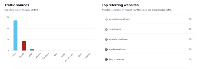
You can also check traffic sources, which tell you where your newsroom's visitors get redirected from. Remember that statistics of traffic sources (such as Facebook, Direct, and Google) and referring websites count only unique visits.
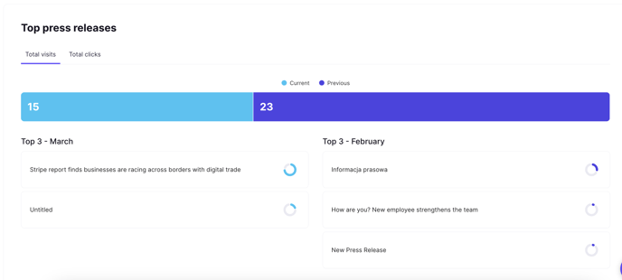
Top press releases
Here you can see your best press releases in terms of visits and clicks. Beneath the chart, you can find your top 3 stories (with their number of visits or clicks) and top 3 stories from the previous time period.
Top emails
This is where you’ll find the overall amount of clicks/opens compared to the analogical previous period, along with your best-performing emails in terms of click and open rates.
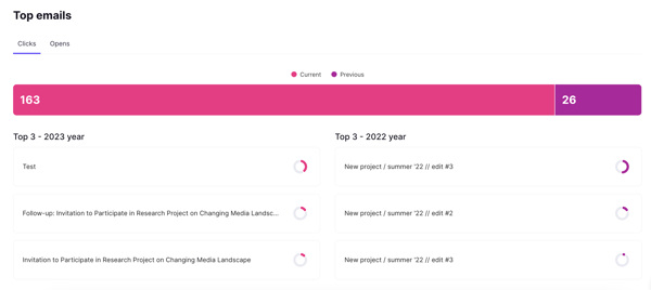
Learn more about email statistics in this detailed article.
Top contacts
In the chart, you can see the exact number of contacts and the respective click rate (or open rate, if you choose Opens instead). Below you see up to 3 top contacts with the highest click (or open) rates within the chosen time frame.
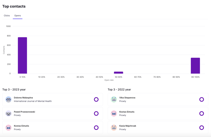
Below, you can access some basic statistics about your contacts. Check how many contacts you had overall in the given period, how many you've added, how many were bouncing, and how many were clicking on your emails (out of all contacts which were emailed).

Emails performance report
Finally, at the bottom of the page, see the most important statistics regarding your email pitches.
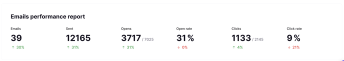
To learn more about what particular email statistics mean, check this detailed article.
Integrate your newsroom with Google Analytics
To track even more data, you can also integrate your newsroom with Google Analytics. You can find out how to do that in this article.
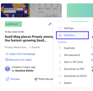
Check the statistics of your press releases
Apart from tracking the general statistics of your newsroom, you can also analyze the statistics from every press release separately. To do so, simply click the cogwheel icon next to the press release and go to Statistics:
 You can see how many times your press release was viewed and how many of these views were unique. Next, are the traffic sources, which indicate where the views of the press release come from:
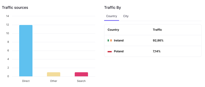
- Direct - traffic coming straight from the press release link
- Search - traffic generated from browser searches
- Email - traffic coming from the press release embedded in an email
- Social - traffic coming from social media posts
- Internal - traffic directly from the Prowly app
In the press release's statistics you can also see the breakdown of traffic by countries, top referring domains, what are the social media sources that people clicked on your press release from and which contacts viewed it via emails.
Analyze your overall PR performance
With all the indicators listed above, you should have a good grasp of your PR performance by now. How about using data found in Prowly to enhance your standard PR reports?
Here’s a useful PR report template for you to leverage
The template comes in an Excel file and contains tabs that represent months and the main tab (M2M Summary), which automatically pulls the general activity stats from individual months, broken down by:
- Unique visits (to all your content pages within your online newsroom)
- Visits by your Audience (unique visits of all your contacts stored in the My contacts module)
- Stories created (the number of press releases created and published in your newsroom)
- Mailings sent (the number of mailings sent via Prowly)
- Average open rate (for your mailings)
- Average click rate (for your mailings)
- Emails sent (the number of contacts to whom mailings were sent)
- Emails opened (the number of contacts who opened your emails)
- Emails clicked (the number of contacts who clicked on the links attached to your press materials)
- Coverage (the number of publications in the media)
- Story of the month (the title of the story which was the most popular in terms of publication)
You will find the above statistics from the first spreadsheet of the discussed document in the form of charts, which will allow you to examine the effects of your activities over time (which is 12 months in this case).
The tabs for reporting activities in specific months can be used to store more detailed statistics (Detailed report section), which will be automatically summed up and included in your general statistics (General report section). Completing the Top media contacts section, on the other hand, will allow you to keep an eye on the contacts who have interacted with you the most in a given month.
Read more about PR analytics on Prowly Magazine.